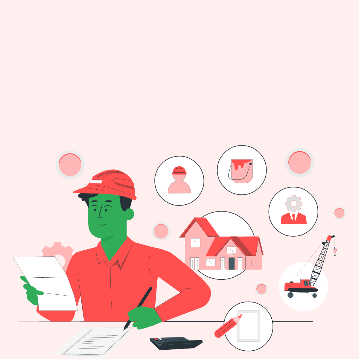
Redesign of Proptibaank fka MO Group
Proptibaank (formerly MO Group) is a company with over 50 active users aged between 26 and 55, offering investment and loan services. Headquartered in Germany, the CEO, Mr. Ademola, wanted to introduce a new feature enabling users to build their dream homes, alongside renaming the company to Proptibaank. However, the original UI wasn’t designed in accordance with a design system, this made it difficult to integrate this feature.
I suggested a redesign of the app, but faced resistance from the engineering team. I explained that incorporating the new feature into the existing UI without a design system would communicate inconsistency to our users, potentially impacting their experience and trust. After thoughtful discussions, we reached a consensus.
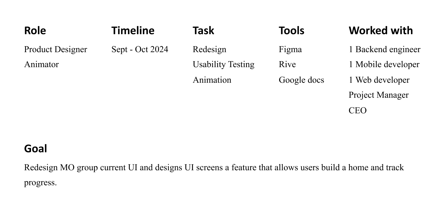
We were to divide a tight timeline of 6 weeks to intergrate the UI for the new feature, complete the redesign and development
With an existing UI in place, I developed a framework of 5 key questions, each addressing the growth and evolution of Proptibaank:
Company’s Goal // What does Proptibaank fka MO Group aim to achieve?
Essence of Redesign // Why is this necessary
EUREKA! // Does the redesign and new feature align with Proptibaank’s fka MO Group vision?
Team's Perspective // Did my design process incorporate diverse viewpoints, or was I biased?
User's Perspective // Is the user experience enjoyable, intuitive, and consistent?
I needed to understand exactly what the company wanted to achieve to ensure that every detail in my design aligns with what Proptibaank (formerly MO Group) stands for. To start, I conducted an interview with the CEO.
He envisions creating a one-stop app where users can invest, take loans, and build their dream homes, with the home-building feature being the latest addition. Although approximately 80% of Proptibaank’s users are Millennials and Gen X, he wants the design to also resonate with Gen Z.
Armed with this information, I distilled three key adjectives that didn't just act a guide in my design but qualifies us as the right company for our current and future users
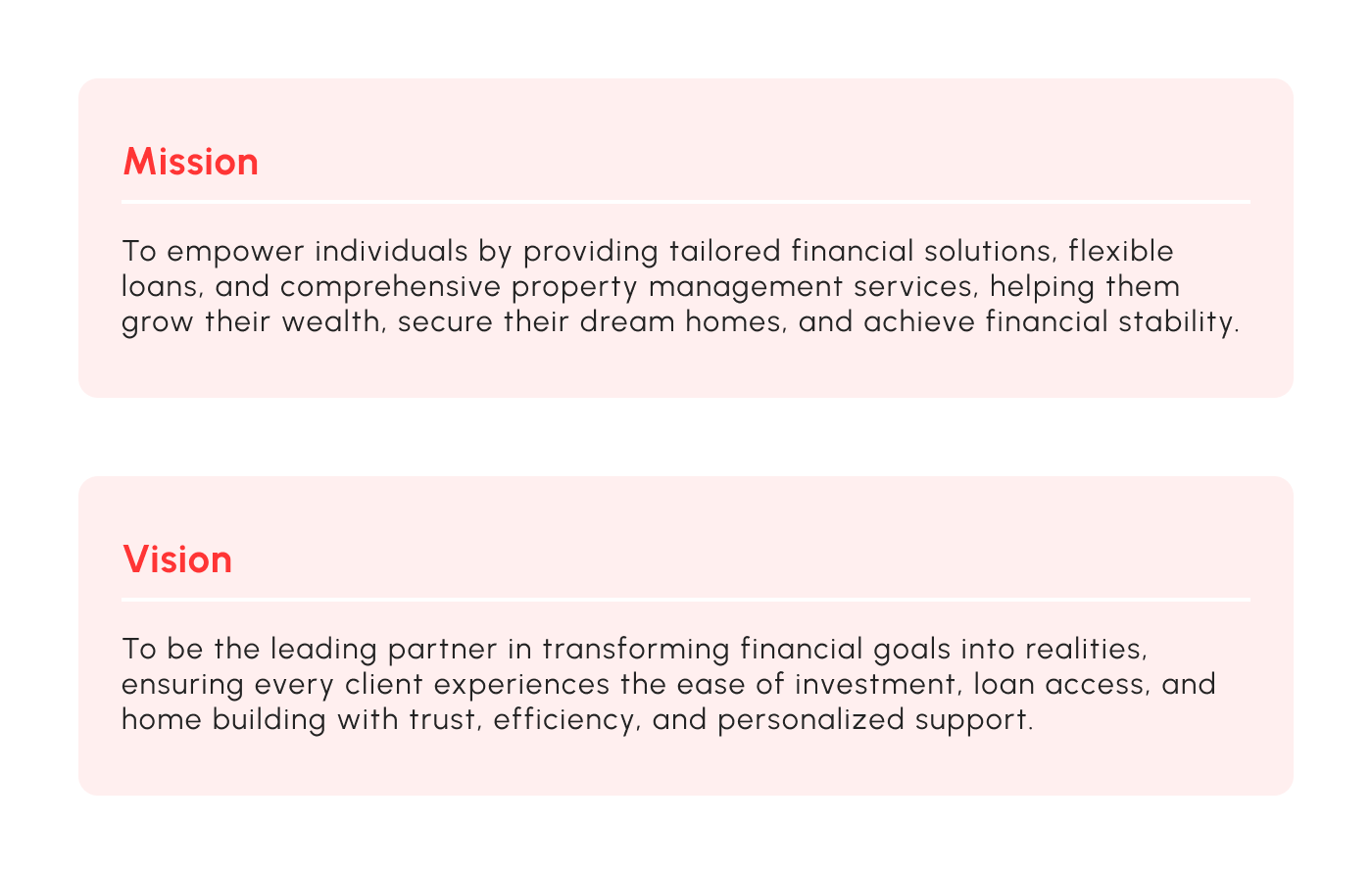
The aim of Proptibaank is to create a product that not only delivers tailored financial solutions but also offers property management services for Gen X, Millennial, Gen Z.
A product can be functional but may lack consistency and communicate a clear message that resonates with its audience.
This was my observation with the old UI of MO Group.
The engineers designed it to their best of ability. They believed that as long as a product functions, it is ready to go. However, there’s more to a product than just functionality, just as there’s more to a song than its beat. Everything must work in unison to convey a clear message. A design system ensures this.
For a company striving to promote financial stability, an inconsistent UI sends the wrong message. After all, stability is rooted in consistency.
The redesign is necessary because we need to follow a design system. It will function as the framework to timelessly embed features , consistently communicating our mission and vision as a product.
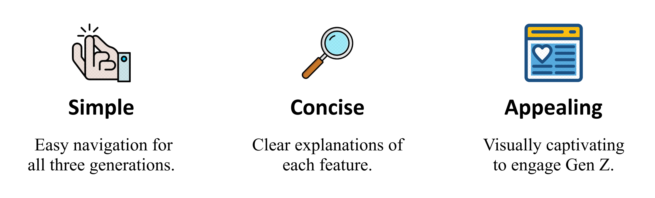
Consistent, Simple, Concise and Appealing. I used these adjectives as pieces of a puzzle to create a design system for seamless experience of our service in creating financial stability. To achieve this, i had to relearn the cores of UI principles by paying attention to how i can use this guiding principles to communicate this adjectives.
For appealing, I created an animation that greets users when they log into our landing page. My intention was to be greeted by 3 features from 1 company.
I had to learn rive within 2 weeks to create this (more in Problems & Solutions)
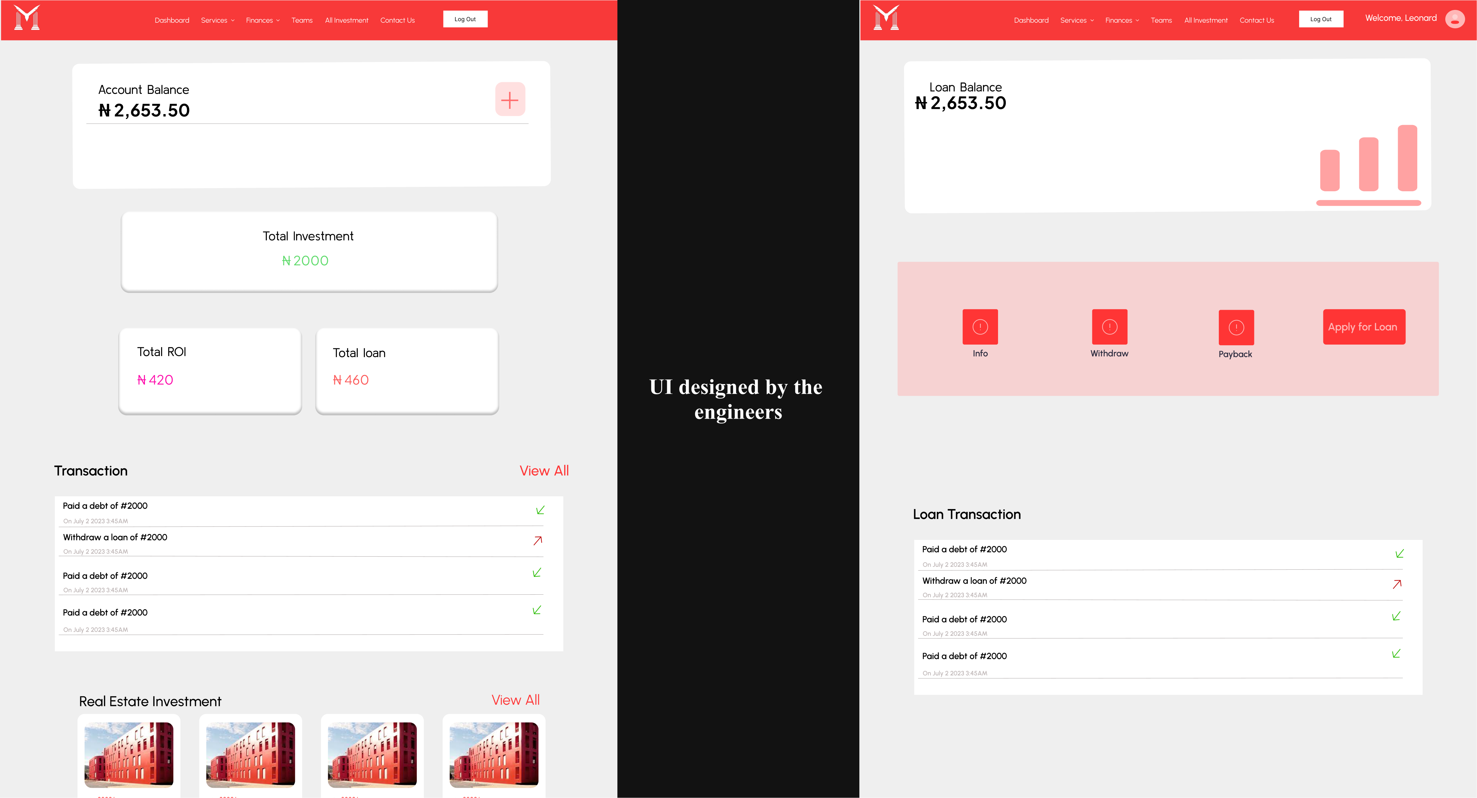
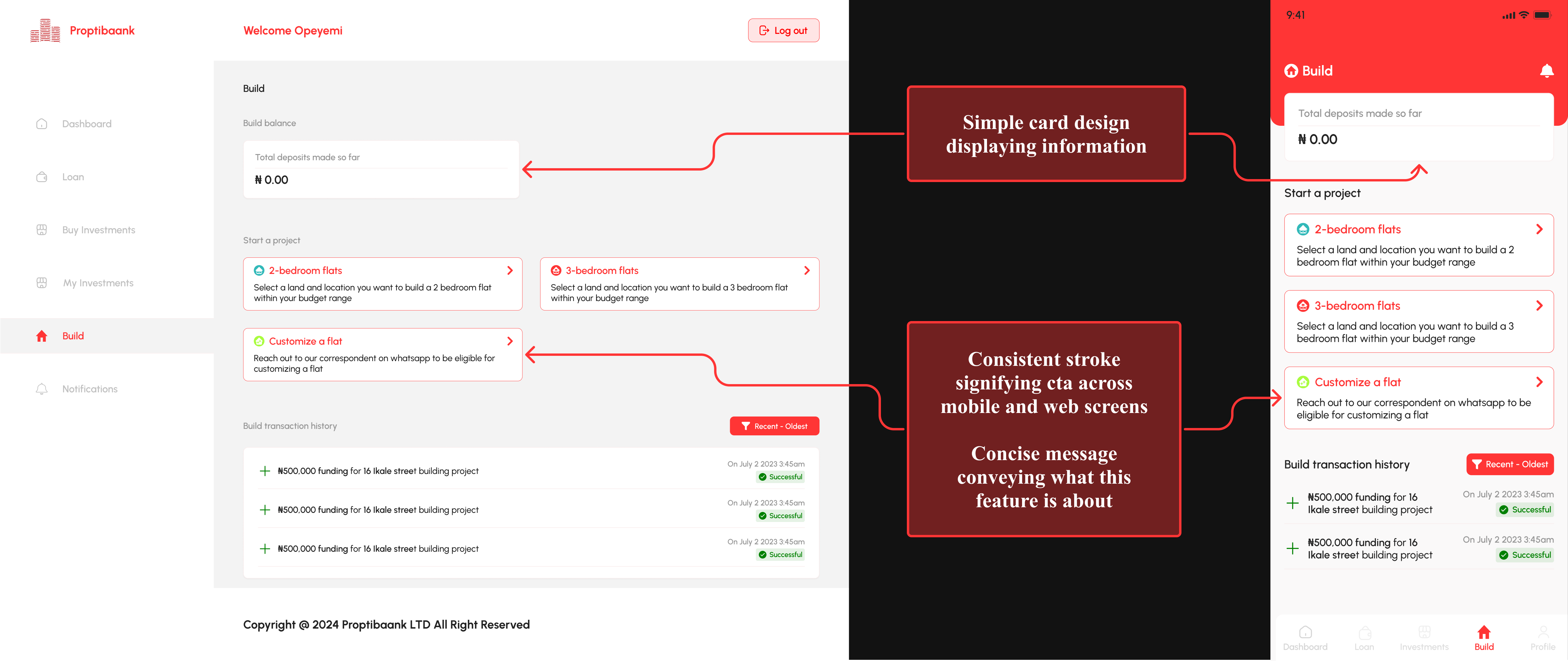
Yes it does. Repetitive layouts and CTAs on mobile and desktop for consistency, short but clear communication of intent for conciseness, animation for appeal, and minimalistic card layouts for simplicity—these building blocks communicate Proptibaank's vision of providing personalization, support, and ease of investment, and its mission of helping customers achieve financial stability.
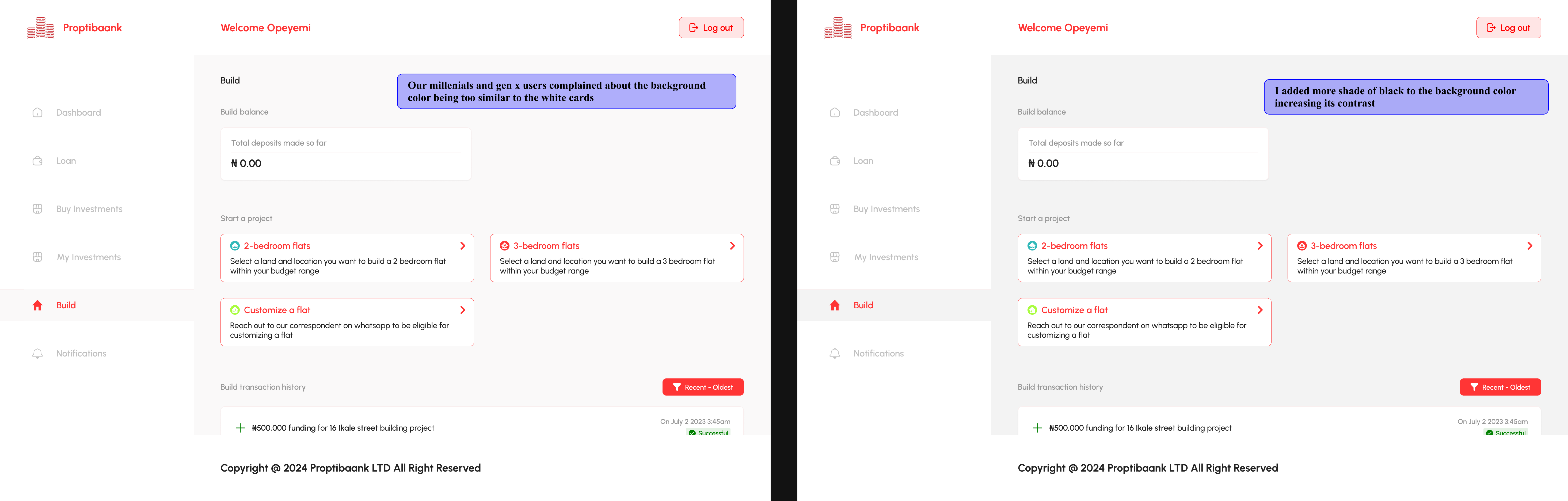
I knew I would make unconscious decisions that either resonated with just me or miscommunicated our product. To avoid this, I sought the constructive perspective from the founding team and CEO . I made sure to ask the reason behind their perspective. “remove XYZ because..” is better than “remove XYZ.”
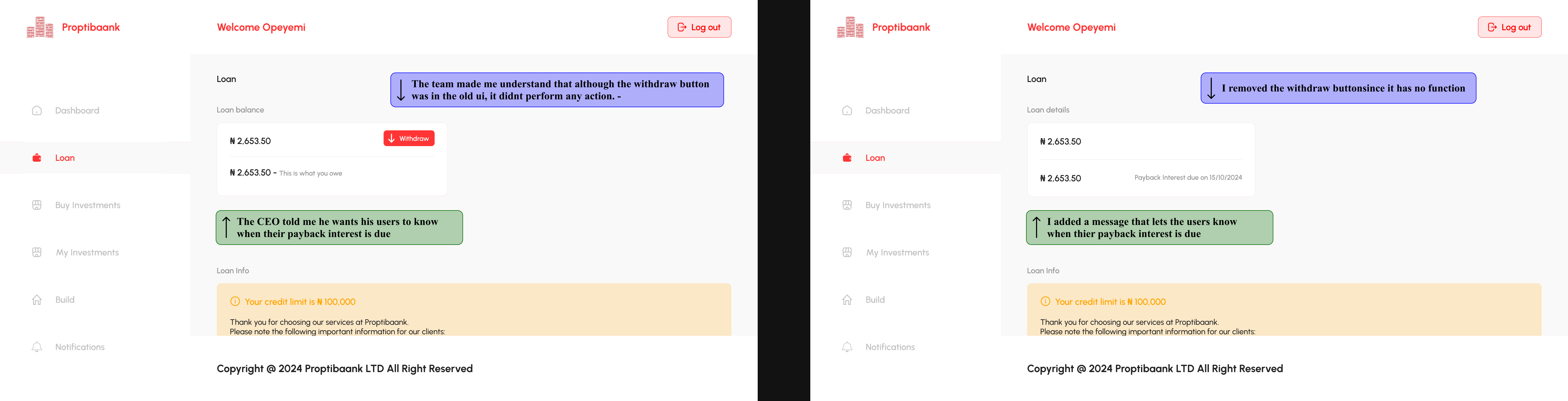
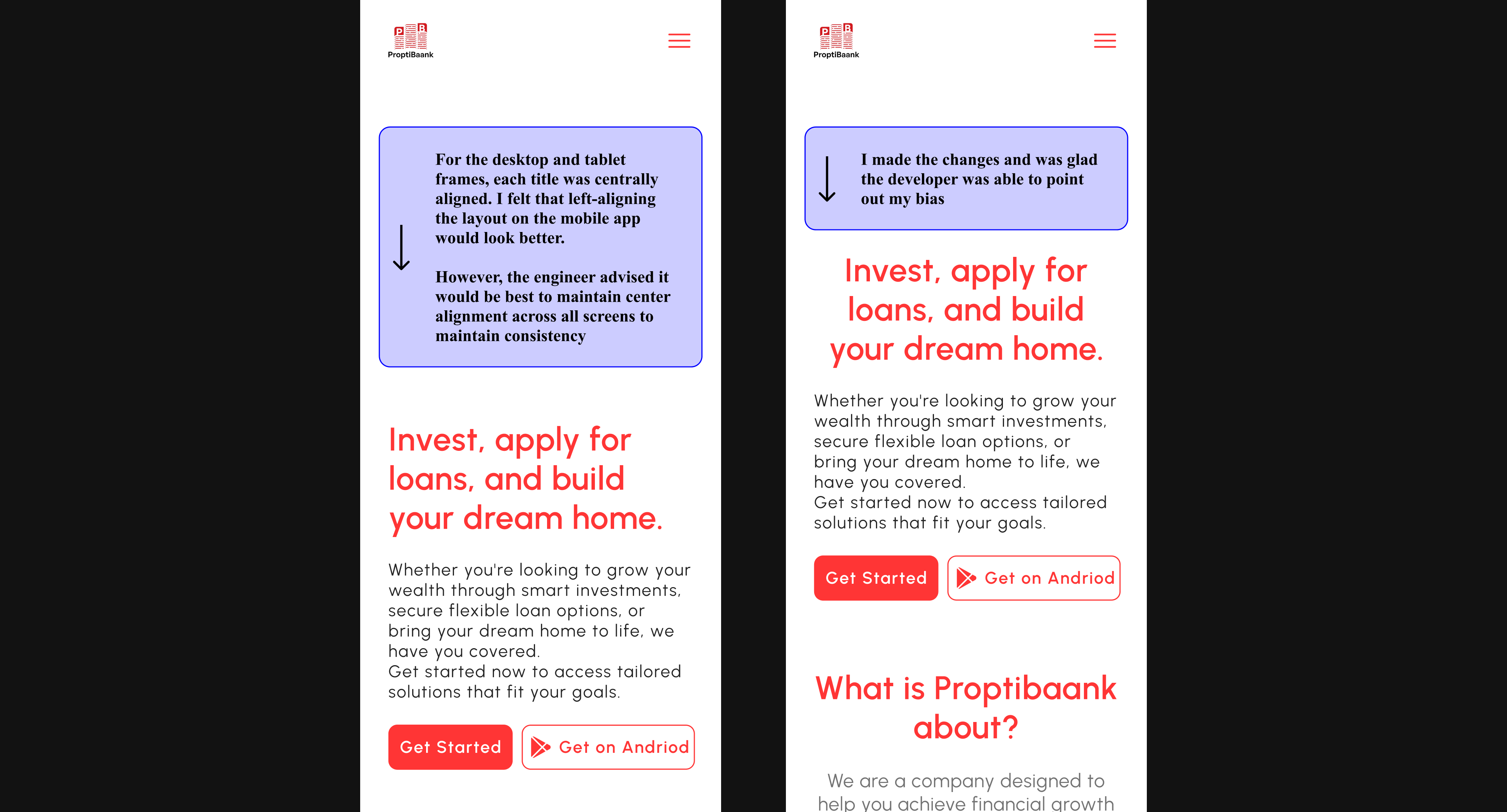
My initial design was biased. Knowing this I sought the perspective of my team and made improvements upon them
With a revised ui and not a lot of time, I carried out 1 usability testing on 3 users. With 1 from each generation. Afterall, the goal is for them to seamlessly use our services.
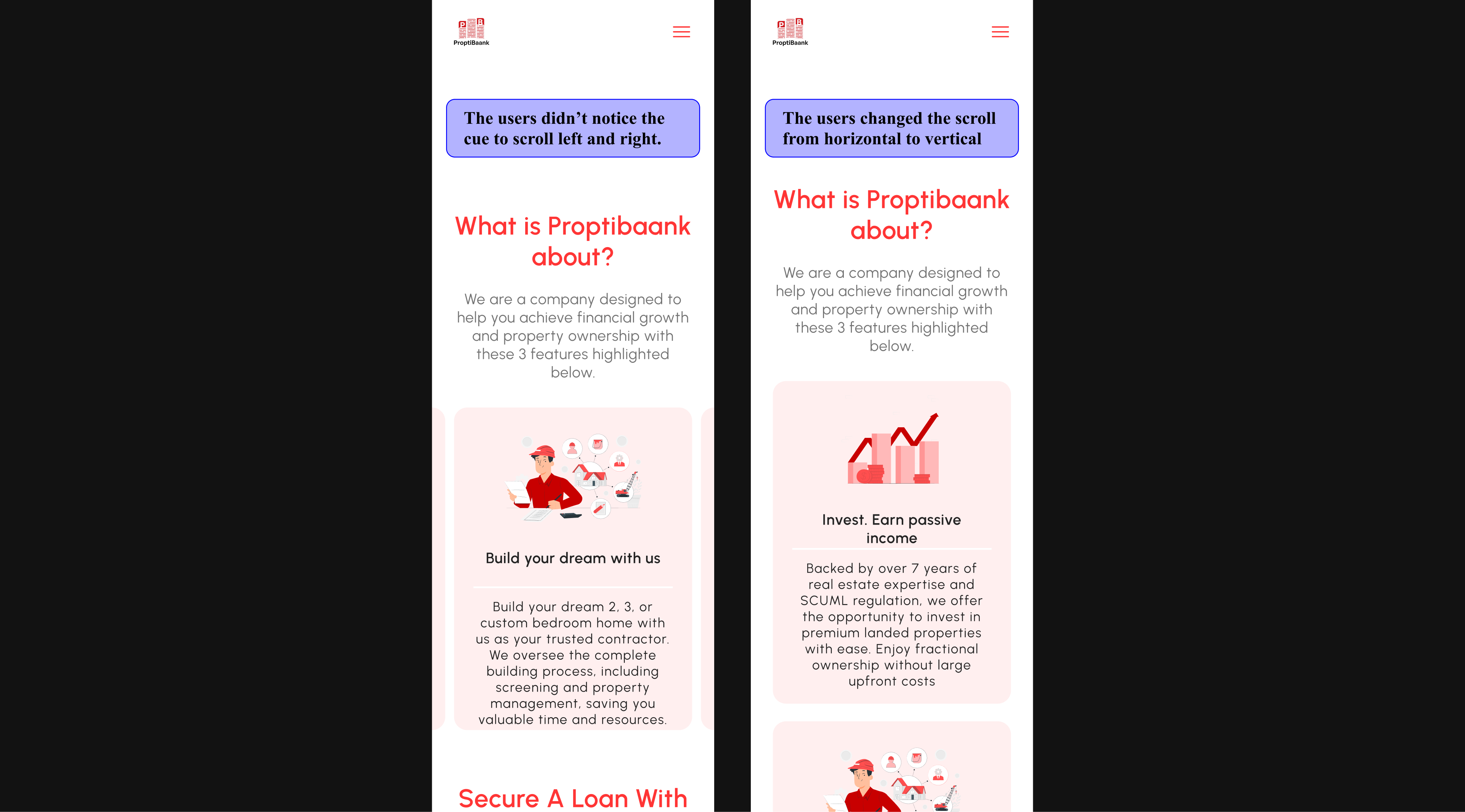
The user experience was excellent for all three user groups, but this isn’t the end of iteration. Proptibaank will continually evolve to ensure it maintains its vision of providing personalization, support, and ease of investment, and its mission of helping customers achieve financial stability.
The entire journey to complete this project was not rivers and roses. From standing my ground to tool learning a tool for animation, these are the problems I faced i their respective solutions.
1) “What if we… I think we should… This looks better on”
Driven by a personal connection to the product, Mr. Ademola initially desired design choices that resonated with his preferences, which could have potentially created friction for users if implemented.
He suggested adding a background image to the mobile web version of the signin and signup page.
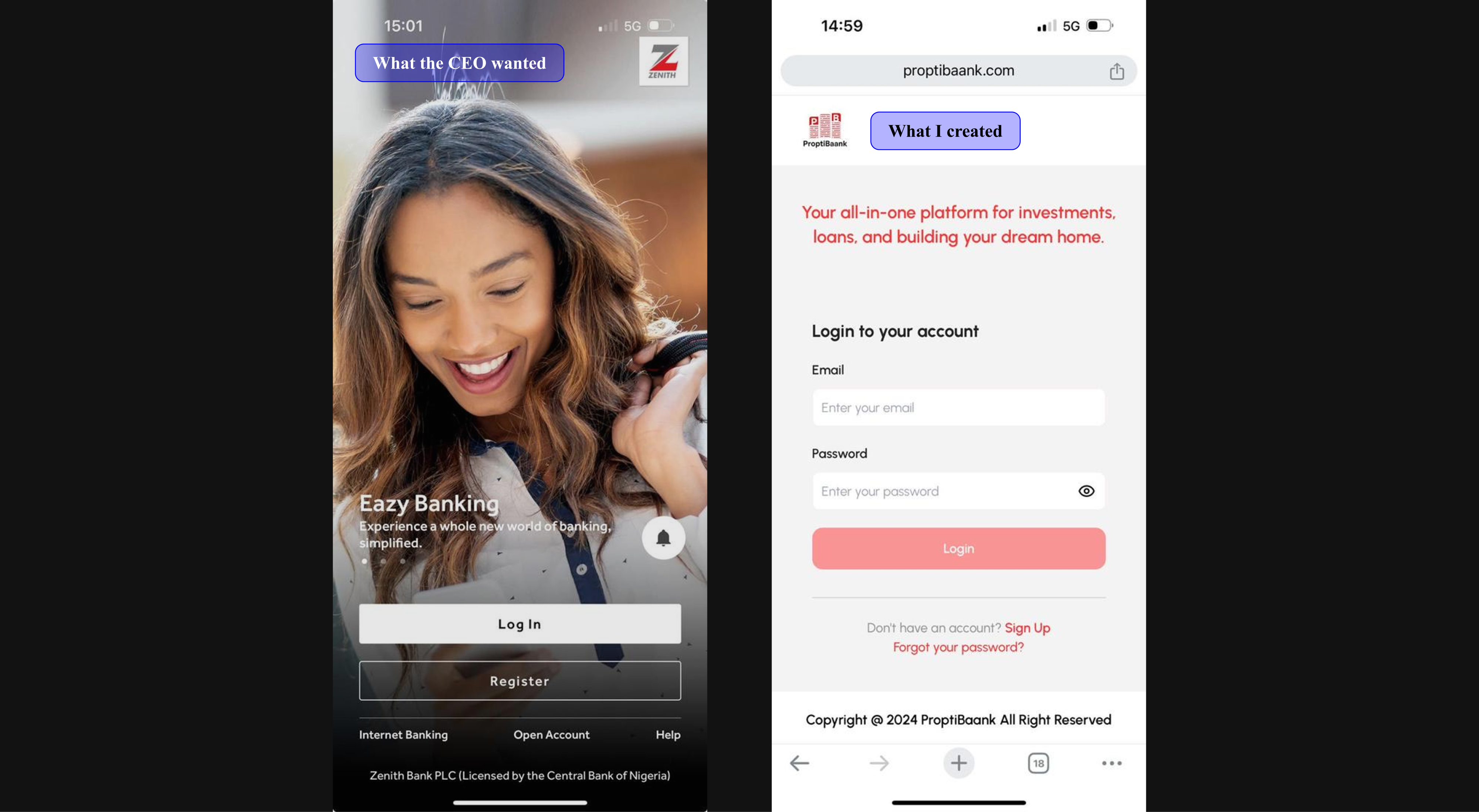
I explained that, given our target audience in Nigeria, adding an a background image could lead to slower page performance due to common network limitations. Instead, I proposed that a simple, clear message would be more effective on our sign-up page. This recommendation convinced him to proceed with my original design.
2) Creating something appealing
In Eureka!, I expressed my goal to make the design visually engaging.
A research on Genz enjoying short content inspired me to create a short animation. I initially experimented with Figma and Lottie components, but the quality fell short. Jitter showed promise, but the file size was too large for a GIF. After further research, I discovered Rive as a solution.
Learning Rive took time, requiring four weeks to create animations in Jitter, Figma, and Lottie, followed by two additional weeks on Rive. With several revisions and late nights, I completed and handed off four .riv files on deadline day. It was a challenging yet rewarding experience.
Below are 3 animations. Click on in conclusion to view the last animation on Proptibaank landing page
Out of the many things I learned while working on this project, what stood out to me was being vocal about the reason for each design choice made. I helped my coworkers and the CEO understand that there's more to me than just making a product beautiful.
When designing with a reason in mind, defending it is easy. But it doesn’t stop there. Some of the choices made might be biased. Accepting constructive feedback and reevaluating the company’s mission and vision are crucial steps to always consider.
Do you want to communicate your value preposition through a digital product or require a solution for an existing problem on your digital product?